Understanding your brand…
Creativeworld were pleased to partner with the excellent performing Heckmondwike Grammar School for their brand development and implementation across the School’s communication channels.
Full Brand Consultation…
We were commissioned by the successful Grammar School to deliver a full brand consultation and implementation, we had to ensure we met the needs of the audience as well as consider the profile of the School.
Brand Discovery…
The initial brand discovery stages (what works, what doesn’t) included a full consultation period with all stakeholders, including Staff, Parents, Communities, Students, Alumni, this was carried out through focus group work, interviews and written feedback from all groups. From this feedback a proposed new brand strategy was created, with the ideas to develop the brand and the usage.
Brand Guidelines…
We created a set of Brand guidelines as well as a toolkit to cover the main aspects of the school’s communication channels, including signage, digital media, prospectuses, stationery, presentations and internal communications literature. This has assisted the School to become more joined up with their branding across all formats.
Services
– Branding
– Stakeholder engagement
Heckmondwike Grammar School
Website:
heckgrammar.co.uk
Primary Logos
The primary HECKMONDWIKE logo is the preferred option for use on the majority of applications. However, if available space is at a premium, then the secondary landscape version can be used as an alternative to maximise legibility.
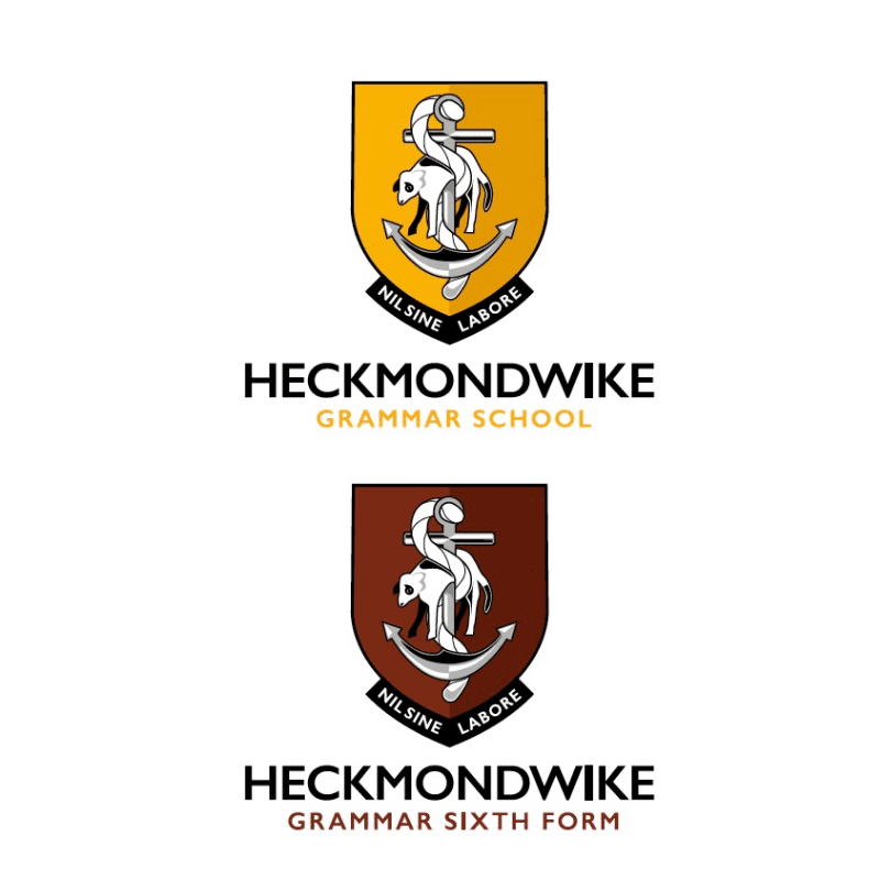
Primary Logos - Variants
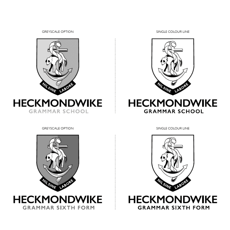
For single colour applications, such as newspaper advertising, there is a single colour greyscale version of the HECKMONDWIKE logo.
There is also a single colour line mark version which can be used for less refined reproduction processes such as screen printing.
Primary Colours
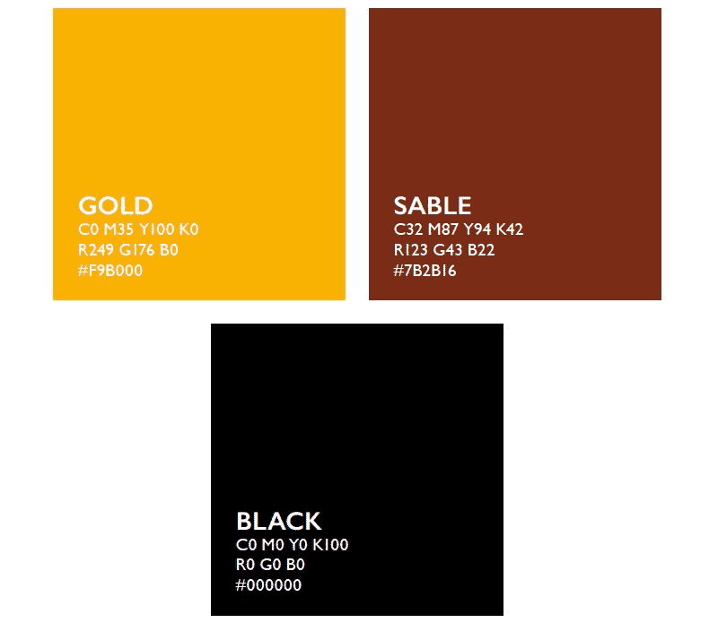
Colour is an important part of the HECKMONDWIKE identity. The brand has two primary colours that differentiate the Grammar School from the Sixth Form.
The primary colour for the Grammar School is GOLD whereas the Sixth Form’s primary is Sable. Both Grammar and Sixth form utilises an accent colour of black.
Secondary Colours
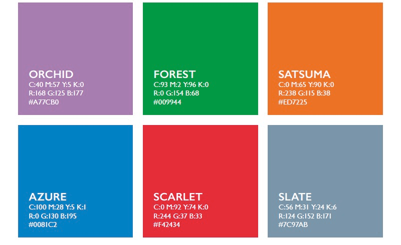
To further enhance and expand the HECKMONDWIKE identity, a bold secondary colour palette has been created. This palette of 6 striking colours has been designed to compliment the primary colours in both the Grammar and the Sixth Form.
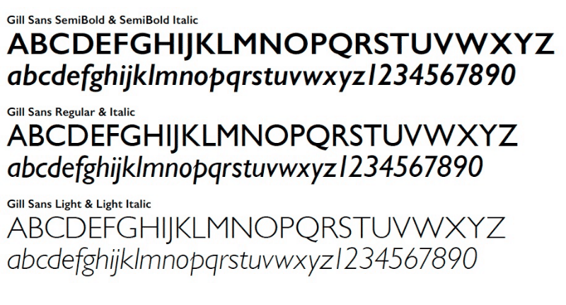
Primary Typeface
The primary font that should be used across all printed collateral is Gill Sans. There are three preferred font weights to be used, both of which have an italic version within them.
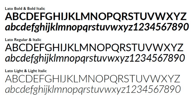
Secondary & Digital Typeface
The primary font that should be used across all printed collateral is Gill Sans. There are three preferred font weights to be used, both of which have an italic version within them.
Application Examples
STATIONERY
Examples of A4 letterhead and compliment slip.
NB: These samples have been created using the Grammar School identity. However, the general design would be applied to the Sixth Form collateral.
SIGNAGE
Examples of external and internal signage demonstrating usage of both primary and secondary logo options.
EMAIL SIGNATURES
Email branding can be overlooked, yet emails are used so frequently that they should also form part a key part of delivering the HECKMONDWIKE identity.
Email signatures are an effective way to reaffirm your brand identity. The HECKMONDWIKE email signature is designed to be responsive and to ‘re-flow’ on modern mobile devices.
NB: These samples have been created using the Grammar School identity. However, the general design would be applied to the Sixth Form collateral.
PRESENTATION MATERIAL
Microsoft® PowerPoint™ software is used extensively within both schools for creating eye-catching and informative presentations. These presentations represent another key opportunity to reaffirm the HECKMONDWIKE branding.
For consistency, the digital font ‘Lato’ should be used throughout any presentation (see earlier section on ‘Secondary & Digital Typeface’ for reference and how to obtain).
As with any other form of marketing communication, close should be paid to the colours used within (see earlier sections on both ‘Primary Colours’ and ‘Secondary Colour Palette’ for guidance).
NB: These samples have been created using the Grammar School identity. However, the general design would be applied to any Sixth PowerPoint™ presentations.


